
GNOME Shell is moving towards a convergent, mobile-friendly UI
About a year after the first official GNOME apps received convergent user interfaces with Purism's libhandy, the most popular Linux desktop seems to be ready to take the next step: migrating to a fully convergent (and thus mobile-friendly) desktop environment by redesigning the Shell to become more scalable (resolution-wise) and modern-looking.
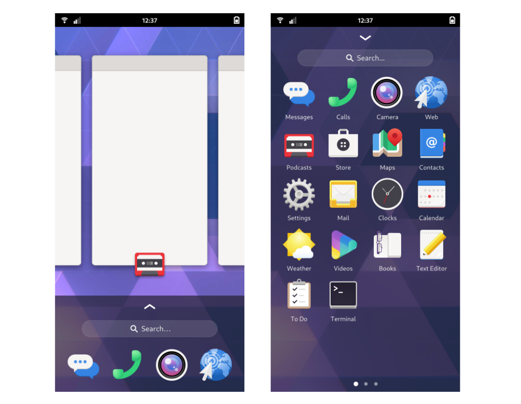
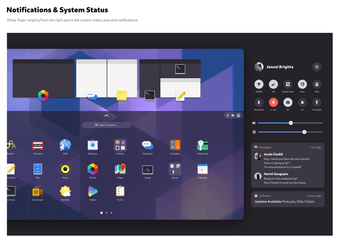
Purism and GNOME designer Tobias Bernard, behind several recent GNOME app concepts and convergent UI designs (most initially aimed at the Librem 5), has published several new mockups in a new "mobile-shell" section of the official design "playground" for GNOME designers, the os-mockups repository.
While the GNOME team constantly releases user interface mockups for all applications, with only a minority becoming reality, inner sources told us that some discussion and early planning is already being made to bring this (or, better, a similar but still convergent) new interface to life. No ETA is known, but some years will be surely needed for the transition to complete.
Also, as hinted some weeks ago, the transition will be gradual between releases, for example going through reworking the current dash and workspace switcher and adding/removing single components of the UI (new notification area, quick toggles...).
Finally, in spite of the graphical changes, we are still far from any "GNOME 4": as no structural back-end changes have been (publicly) planned yet, you will probably still have to put up with the JavaScript and St bits.
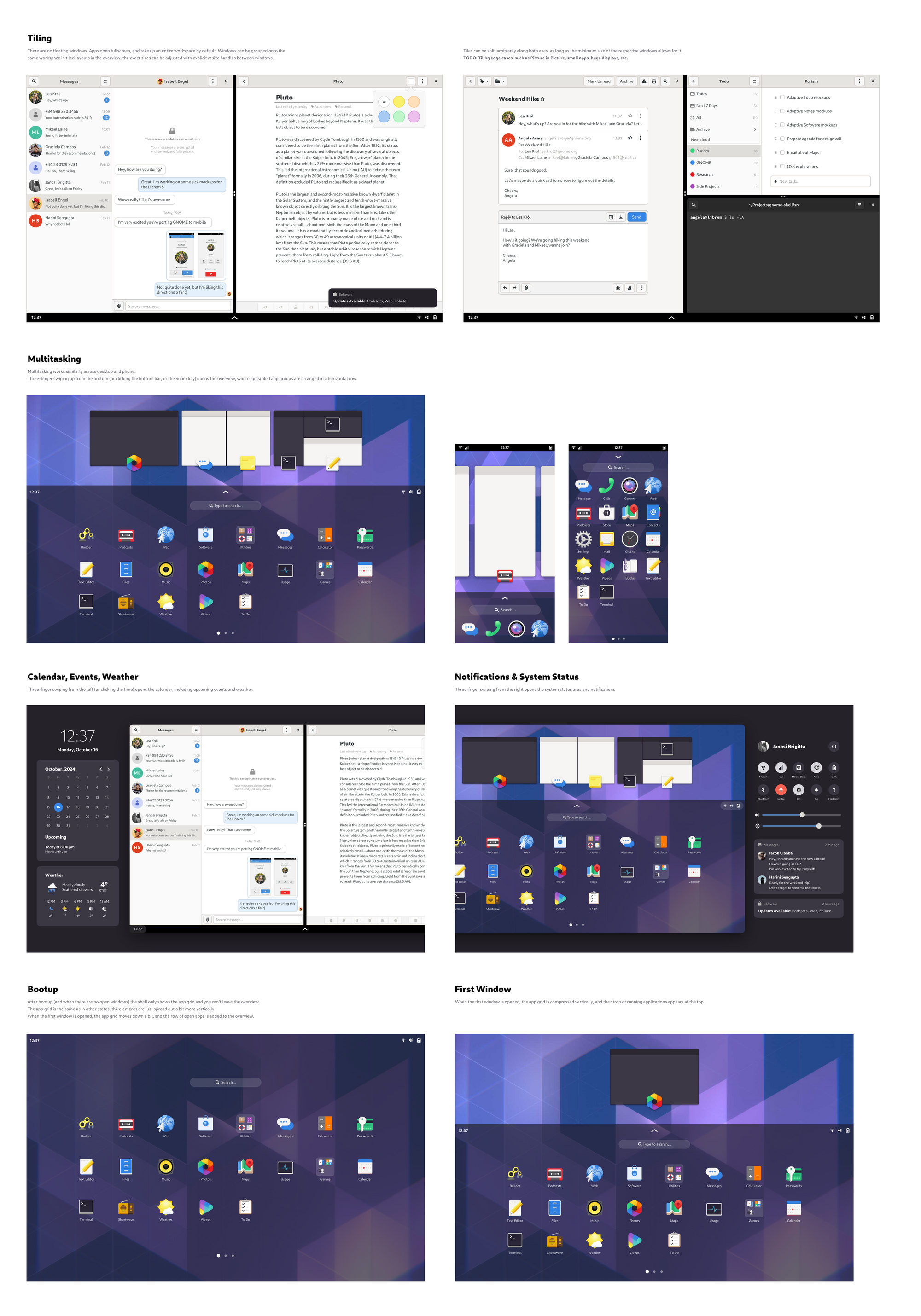
As these mockups are likely to change often in the next weeks, you can always see the latest version from the official design repository here.
You can follow TuxPhones on Twitter and Mastodon, or join our subreddit to have the latest news about Linux smartphones.
Via: GIMPNet (Matrix/IRC network)
Comments ()